Concept Project Rinse
INDUSTRY
INDUSTRY
Beauty
Beauty
CLIENT
CLIENT
RINSE
RINSE
ROLE
branding, digital presence, web design
ROLE
branding, digital presence, web design

Visual Identity & Brand World
Visual Identity & Brand World
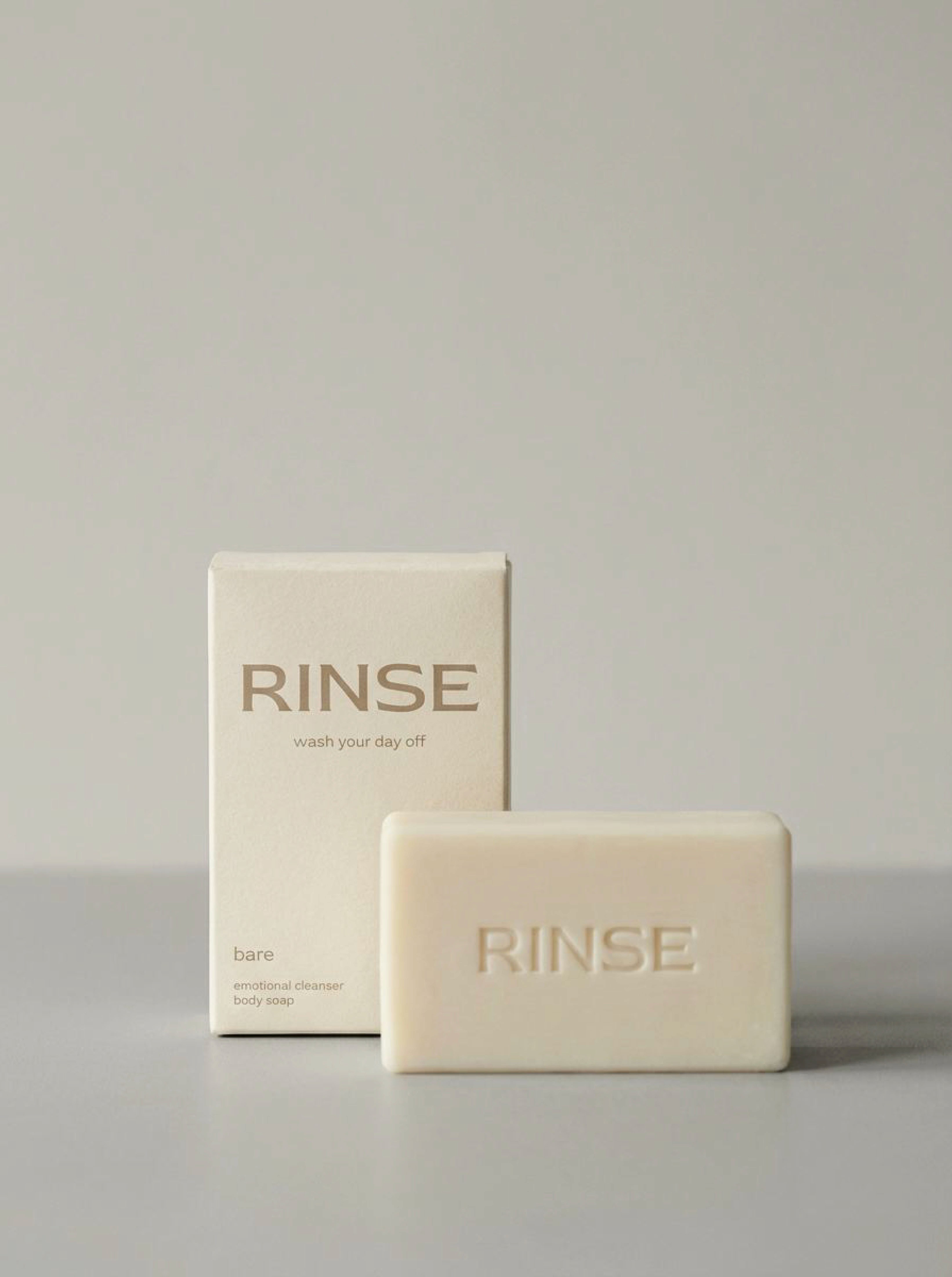
RINSE is a conceptual soap brand that reframes body care as an emotional ritual. Designed as an editorial-first brand, it lives between fashion photography, intimacy, and everyday routines, treating cleansing as a quiet reset rather than a functional task. The brand is built around the idea of washing the day off, physically and emotionally. RINSE was imagined for independent, aesthetic-driven consumers who value intimacy, routine, and simplicity. Instead of positioning soap as a wellness product, the brand approaches it as a personal moment: private, tactile, and emotional. The visual language draws inspiration from fashion editorials, bathrooms, skin, steam, and stillness.
RINSE is a conceptual soap brand that reframes body care as an emotional ritual. Designed as an editorial-first brand, it lives between fashion photography, intimacy, and everyday routines, treating cleansing as a quiet reset rather than a functional task. The brand is built around the idea of washing the day off, physically and emotionally. RINSE was imagined for independent, aesthetic-driven consumers who value intimacy, routine, and simplicity. Instead of positioning soap as a wellness product, the brand approaches it as a personal moment: private, tactile, and emotional. The visual language draws inspiration from fashion editorials, bathrooms, skin, steam, and stillness.
Visual Identity
The identity system is intentionally reduced to allow imagery and texture to lead. Color palette: deep forest green and warm cream, supported by soft stone neutrals Typography: an elegant serif paired with a quiet sans serif, balancing emotion and clarity Tone: calm, confident, intimate, and understated Rather than extensive rules, the brand relies on consistency through mood, light, and materiality.
The identity system is intentionally reduced to allow imagery and texture to lead. Color palette: deep forest green and warm cream, supported by soft stone neutrals Typography: an elegant serif paired with a quiet sans serif, balancing emotion and clarity Tone: calm, confident, intimate, and understated Rather than extensive rules, the brand relies on consistency through mood, light, and materiality.

Brand World
Brand World
RINSE lives through imagery. Editorial still lifes, human presence, bathrooms, skin, steam, and water form a visual language rooted in intimacy and routine. The focus is not on perfection, but on quiet moments and personal rituals.
RINSE lives through imagery. Editorial still lifes, human presence, bathrooms, skin, steam, and water form a visual language rooted in intimacy and routine. The focus is not on perfection, but on quiet moments and personal rituals.


Outcome
Outcome
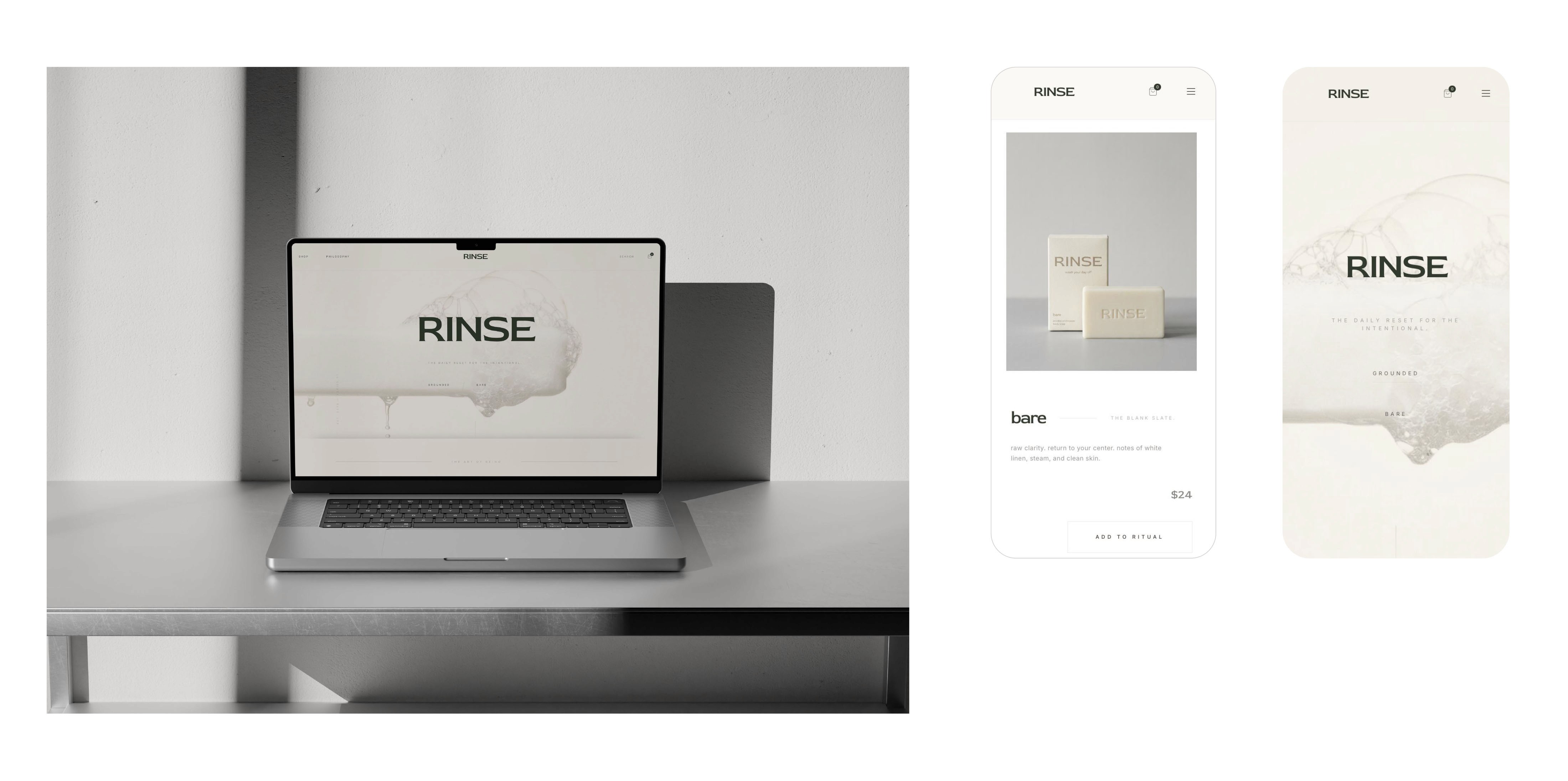
RINSE demonstrates how a reduced visual system, when paired with strong art direction, can create a cohesive and emotionally resonant brand world. The project explores how branding can feel personal, calm, and intimate, without excess or noise.