“Virginia was awesome to work with! Communication was great, she worked with urgency, and was always ready to go above and beyond to make sure I loved the deliverables. She brings that rare "artistic eye" which is very valuable.”
Beowulf- Founder of Maneup
MANEUP
INDUSTRY
INDUSTRY
Health
Health
CLIENT
CLIENT
Maneup
Maneup
ROLE
REBRANDING, VISUAL IDENTITY, PACKAGING DESIGN
ROLE
REBRANDING, VISUAL IDENTITY, PACKAGING DESIGN

Maneup
Maneup
Maneup Labs is a performance-driven wellness brand focused on science-backed hair and scalp solutions. The objective of this project was to elevate the brand’s visual presence through a refined packaging system and a cohesive set of premium product renders for e-commerce and marketing. The end result needed to feel modern, clinical, and high-performance, while remaining clean, minimal, and trustworthy.
Maneup Labs is a performance-driven wellness brand focused on science-backed hair and scalp solutions. The objective of this project was to elevate the brand’s visual presence through a refined packaging system and a cohesive set of premium product renders for e-commerce and marketing. The end result needed to feel modern, clinical, and high-performance, while remaining clean, minimal, and trustworthy.
CREATIVE DIRECTION
The visual direction centered around a dark, performance-led aesthetic to reinforce efficacy and perceived quality. Key principles: High contrast and controlled lighting Product-first compositions Minimal, confident typography Consistency across SKUs and formats Two visual lanes were explored early on (light vs dark), with the final direction leaning into a darker, more technical look that best aligned with the brand’s positioning.
The visual direction centered around a dark, performance-led aesthetic to reinforce efficacy and perceived quality. Key principles: High contrast and controlled lighting Product-first compositions Minimal, confident typography Consistency across SKUs and formats Two visual lanes were explored early on (light vs dark), with the final direction leaning into a darker, more technical look that best aligned with the brand’s positioning.


PACKAGING DESIGN
PACKAGING DESIGN
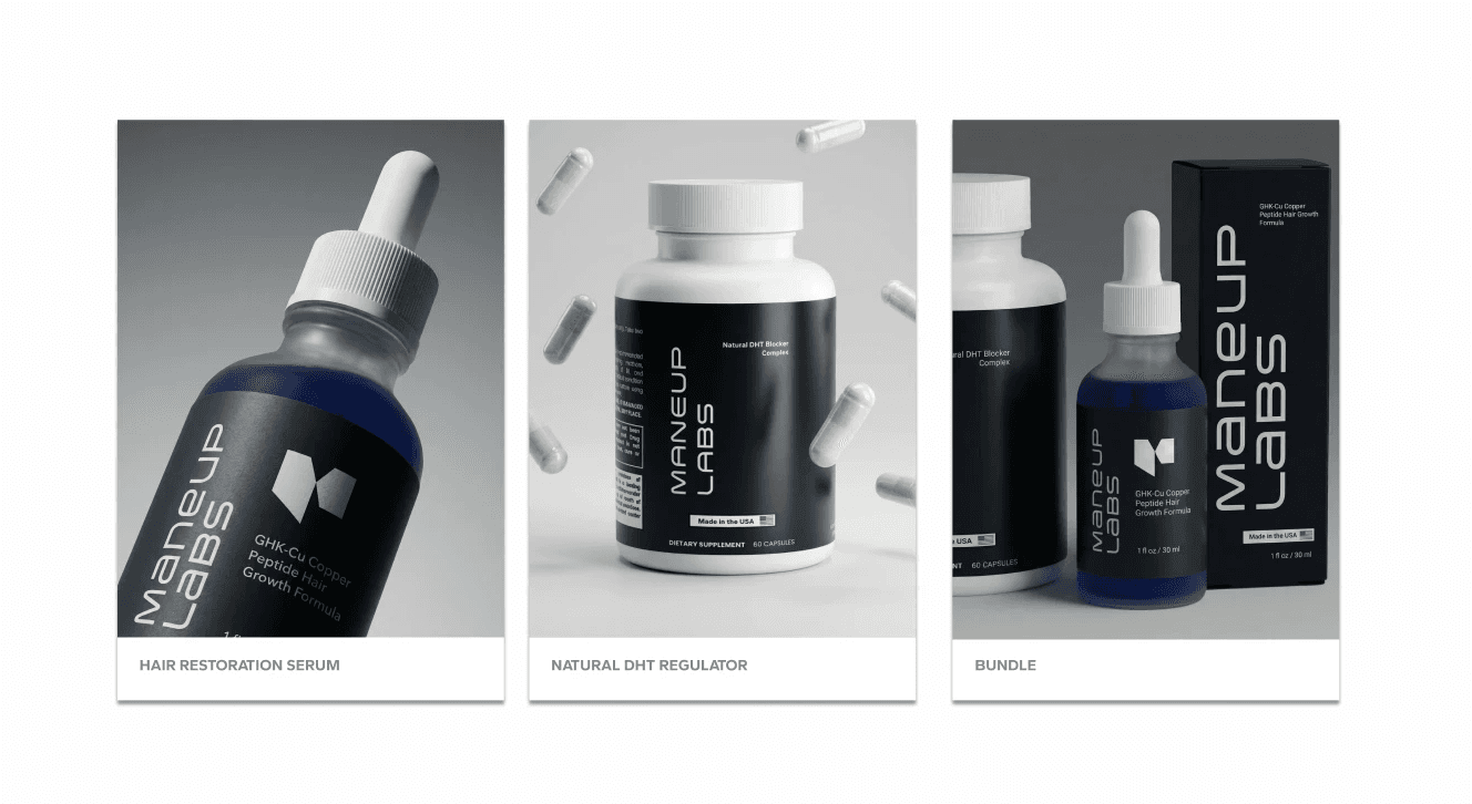
The packaging system was designed to be: Clear and easy to read at a glance Consistent across serum, supplement, and bundle Balanced between branding and functional information Special attention was given to hierarchy, spacing, and regulatory content to ensure the designs were both premium and production-ready.
The packaging system was designed to be: Clear and easy to read at a glance Consistent across serum, supplement, and bundle Balanced between branding and functional information Special attention was given to hierarchy, spacing, and regulatory content to ensure the designs were both premium and production-ready.


OUTCOME
OUTCOME
The final system delivers a cohesive, premium visual foundation that positions Maneup Labs as a credible, science-forward brand in the men’s wellness space. The assets are now ready to scale across: - Product detail pages - Marketing campaigns - Brand communications


